Thursday, February 8, 2007

First appearance of the character

When one directs music-videos and TV- commercials on demand one usually works with ready soundtrack. As much as I don’t like -not to be author of everything in my work- I have to admit that it is challenging to adapt to what is already there. Maybe it’s immodest but I see it as if Michelangelo has to adapt his painting to the space on the wall (which he had to).

I was asked to make this animated commercial for a radio-station, and they already had audio commercial that was 16 seconds long. It was somewhat descriptive. Something like Pepsi-cola promotions. You hear the sound of two ice cubes breaking into the glass, then a cork pops out, the sound of liquid pouring into the glass, and hissing noise- then a voice says a line- 100% natural, no hilly-billy no kitsch - a gurgling sound and the name of the radio followed by a swallowing sound.

The thing they had in mind was to draw some man drinking some kind of juice, but for me it was to obvious. I have this rule that I will throw away first three ideas as common. Because that’s something anybody would think of, and then adopt a fourth idea that comes to my mind.

The idea was to make stereotype characters who exchange their roles. There is a Disney’s cute, angel-like princess, but she is impatient and demanding, and there is a witch who is clumsy, and frightened by the temper of the princess.

the witch is suppose to turn a frog back into the prince. And it seams as if she is not very successful. Now I had to explain that the preparation is taking time and princess is still waiting. Now she is angry of witch and the witch understands that it’s her last chance of getting it right or else…

When you create a character the main rule is to show the audience- who the character is- in the first scene. In this case it had to be the first shot (because of the short duration). In less then a second.

My first solution was to get a shot of the hand, with fingers tapping on the table. But when I tried it on the time line it was just not possible as it would require another shot to show the princess for the first time, and it just couldn’t fit it to those 16 s. I needed a new solution.


The princess had to be visible in the first shot. So I needed someone wicked, bored, inpatient, but still she had to say that she has the power over the witch. Means she had to feel right and comfortable where ever she is. Even in the witch’s laboratory, surrounded by frightening objects such as sculls, poisons and all sort of witchcraft.

So, the only solution was to put her legs on the table.

I had to visualize the position of the had and the hands so… the first sketch was of myself :D.

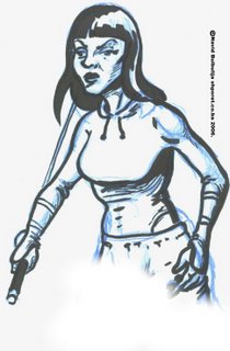
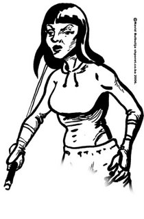
Then I had to make the princess lok little more feminine. I usually draw the body construction and then lay the clothes over the body.

The first drawing was not what I wanted. I wanted someone cute and innocent. This one was a bich. (the princess had to be wicked but she also had to be the image of innocence)

a bit of childish look and I got a perfect first shot.

This picture should say to the audience that the princess is waiting. She is confident. She feels that she is the master of the castle, even the most scary parts of it. And that everybody should fear of her decisions. If the princess was a bit more wicked it would imply that she didn’t wait so long and we want to show how much of the wrong potions did the witch prepare till now.

I understand that sometimes you have to lose details that you really like (as I did with the tapping hand) because of the complete picture, and you hate it but it pays of in the end eventually. When you simplify the structure everything becomes more clear.


Monday, November 27, 2006

Max Bunker in Zagreb


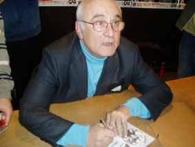
Last night my girlfriend took me to a comic convention, “crtani romani show” in ZKM in Zagreb, where their guest, Max Bunker, author of the Italian cult comic “Alan Ford”, was answering questions about this serial.

Alan Ford as Bunker said owe it’s Popularity in the countries of Ex- Yugoslavia to Nenad Brixi, the man who didn’t literally translate, but actually invented the expressions in this comic. But what really was especially interesting for me was not the fact that the comic never really had any popularity in other countries except Italy and Yugoslavia, but bunker’s arrogance and the way he tried to ignore every question about Magnus (who was the other part of Magnus & Bunker tandem) and his significance to the serial.


One could get an impression of that famous relationship between coauthors of the comic, where the artist always takes all the fame and the writer ends up with no credits at all. In this case I guess that artist did get all the fame but writer got the riches. I couldn’t stop thinking of Magnus’s later works, Very serious in fact, such as Alias Unknow. And the contrapuntal Alan ford in it’s later years. Maybe Americans can not understand the need to stop the serial when all is drawn from the story and the situation. But we here feel that there is no need to tell the same story again. This situation exists in the Balkan because we never had any comic industry. All was done individually. Because very few authors could actually live from their work there was no need of making things less then fun. And I believe that’s what the comic should be- pure fun. I don’t think someone should reed a comic because of it’s addiction.

One of the attendants noticed that tone equipment was as if it was provided by Grunf (crazy inventor- ex- third reich pilot). Audience in the back, couldn’t hear anything so they started to be sarcastic, and it was strange that max bunker, the legend, wasn’t finding it fun. He actually used all the answers to commercialize his product. It is funny that something you read since you were a little kid and was so incredibly funny and ingenious, could be done by someone so interested in it’s material value. But the strangest thing was that, Bunker was so determent to dement something so obvious, something we all knew, that, same as Magnus drew him self as Bob Rock (one of the characters), he also drew Bunker few times in the comic. Usually Bunker appeared as a suicidal man who is not able to kill him self. And I remember that once he drew him self in the flat of the old building as a poor cartoon artist throwing darts in Bunkers picture on the door. I just feel that I cannot read a comic when I know the author didn’t enjoy making it.

Wednesday, November 22, 2006

COL- ERASEless

My first post here. I'm doing an animated music video these days- my first serious, classical, hand drawn, frame by frame, animation. I think I will place some of the sequential drawings later. When I went to get some instructions in the Animation and New Media Academy in Zagreb- they thought me how to draw my sketch with the tech-pencil and later trace it on the light-box. I used it since, and have produce one comic-strip that way, but I noticed that my drawings are loosing the touch. The line lost it’s freshness, and since I started using felt-pen instead of ink, my comic got the Japanese kind of feeling, which I considered then as a quality and character of the drawing, but as I finished the comic and took it to some friends from academy to see it I suddenly began ashamed of my work. As if I cant draw anything.

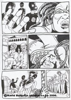
This is what my pages turned into when processed that way…


I don’t say my penciling is great, and this isn’t a perfect example but there is much more of the anatomy and shading before my light-box processing.


My desperate look made one friend of mine to speak about some tutorials he found on the net. So he gave me his interpretation of what he read (I have to explain that; in our, post-communist countries things like col-erase pencils, and other capitalist shit, wasn’t really what you can see in all art stores): "You do the sketch in blue (meaning any blue colored pencil) and then scan it- turn to black and white mode, and the blue will disappear".

The story didn’t quite fit my reason ‘cause I kinda knew that if you turn it to black and white the colors of smaller valer intensity will turn to raster, that’s what I was getting all the time when scanning my pencil drawings. And I liked the result but that was not the way to get rid of the under-painting. And I just continue to work my way. But the loss of freshness in the drawings just kept bothering me all the time. Not mentioning that all the drawings I found on the net used blue under the black drawing. It just made me crazy… last night I took some blue pencil I found in my drawing kit and started the procedure. I don’t have to tell you how satisfied I was, and finally I could do the rendering and rasterizing with no fear that I will blow up the line. And this is what I’ve got…

The morning came. Had to erase the blue lines. No way. Converting to black and white mode gave no result. I’ve done my one little investigation about the problem and found out what you call col-erase pencils, but what to heck, now I wanna erase the blue digitally. Here’s what I’ve done (as I don’t use p
hotoshop-like all true professional artists- I will give you my solution in corel photo-paint but the point is the same):

Under Image>Adjust>Selective Color you minimize magenta and cyan in the blues, now you have a bit of light gray where there was blue. Now go to the Image>Adjust>Brightness-Contrast-intensity and toggle a little between contrast and brightness (I set brightness to about 7 and contrast to 11, but it depends of the drawing) until you loose all of the gray from the drawing. You’ll notice that if you set high contrast you’ll lose some of the thinner lines from the drawing. Now I end up with erased blue lines from the drawing but I have very pale black lines. I want to make them 100% black. Here’s what I usually do. I go to Object>Create>From Background and, using the Transparent Color Selection Tool simply turn white-transparent. Now again go to Image>Adjust>Brightness-Contrast-intensity and turn brightness to 0. You end up here with 100% black, clear drawing but with rough edges. Now I use smooth to get something more like I wanted. This is the final…

Please if you know a simpler way of getting this and of course the way to get my drawing better. The line still loses when I blur it. I’d be grateful to learn. Drop me a link in the comments or private. But I guess I’ll be of to buy those pencils these days, anyway. Thank you.